Stakeholder interviews, UX, design, development, art direction

Strategy & design combine to launch a new product suite.

LiveRamp’s technologies, platforms and services help brands and businesses provide relevant marketing content to consumers.

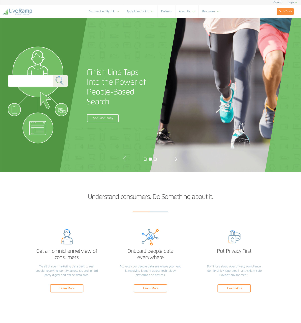
LiveRamp home page

Hero banners are comprised of images and vector graphics in order to conceptually convey the page contents and also to help define a UI pattern beyond the more conventional hero banner of large type over a darkened image.

Project focus

  • Design a new product-focused website to coincide with a series of new product launches
  • Define LiveRamp as the industry standard in Cross-Channel Identity
  • Focus the user experience on introducing the products and services and how these products provide business solutions for LiveRamp’s core audiences ...
  • ... while also allowing users of varying knowledge to explore (and easily find) the content relevant to them
  • Utilize video for testimonials and product overviews to maximize engagement
  • Update the site with revised structure and messaging for IdentityLink and it’s audiences
LiveRamp product page
LiveRamp testimonials

Building an effective site structure and UX

  • Audience first
  • Lead with the benefits
  • Start broad, and then drill-down
  • Provide a clear call to action to drive a user towards your goal (contact form)
LiveRamp site architecture
LiveRamp annotated wireframe

Results.

  • 61%

    Page views increased

  • 23%

    Bounce rate decreased

  • 87%

    Increased engagement of Resources content

  • 55%

    Increased blog views

Showcase LiveRamp's expertise

Provide users with quick access to industry leading articles and related content throughout the site, as well as a one-stop resource hub.

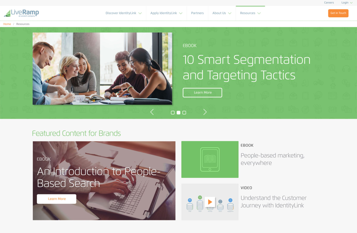
LiveRamp resources hero banner
LiveRamp resources and filters
LiveRamp resources
LiveRamp responsive design

All projects.